Woooba

A social sport platform to help people play more sport.
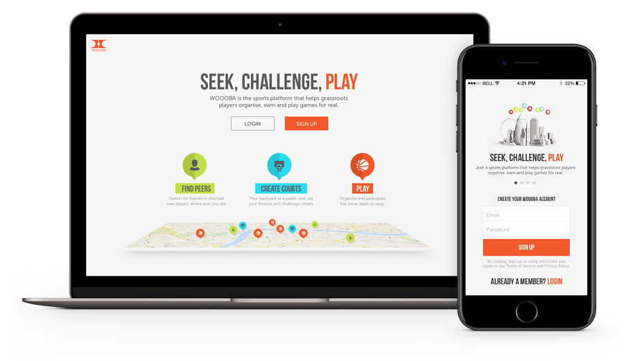
"To organise a match has to be as fun as playing it", that has been the main reason behind WOOOBA's design, a global platform where users can organise games, find sports facilities, available players and deal online with all the hassle required to practice sport in real life.
I worked on the interface of the responsive website and iOS app for this startup. As the Lead UX/UI Designer, I had to visualise all the different user journeys and quickly come up with UX solutions to accomodate all business and user requirements. Desktop and mobile prototypes help the team understand the many functionalities and user flows.
Demo video explaining the different funcionalities included in the iOS app.
User is king
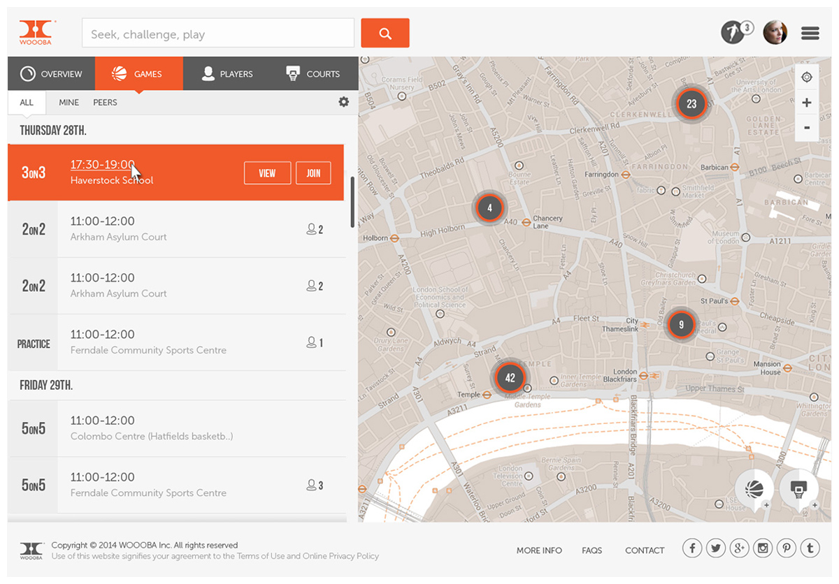
The app is designed to make it easy for users (players and match organisers) to search, filter, find and discover relevant basketball courts and players around their physical location. A vivid yet simple style is part of the design that wants to suit different sports and users in the future.
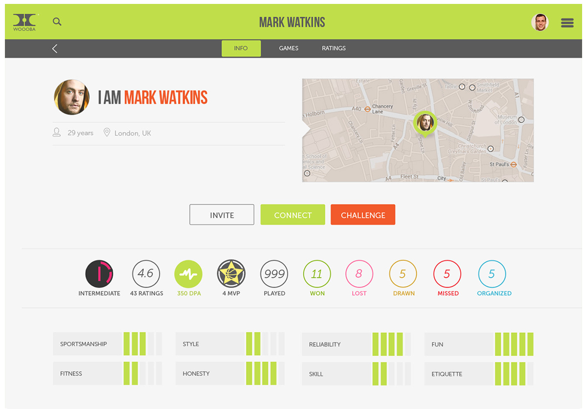
Badges are among the most visible elements of gamification as well as a quick way to rate players after each game.
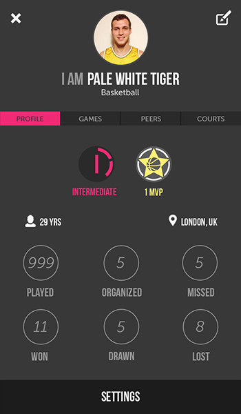
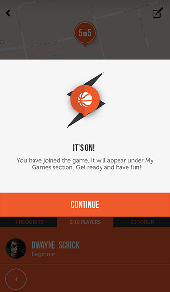
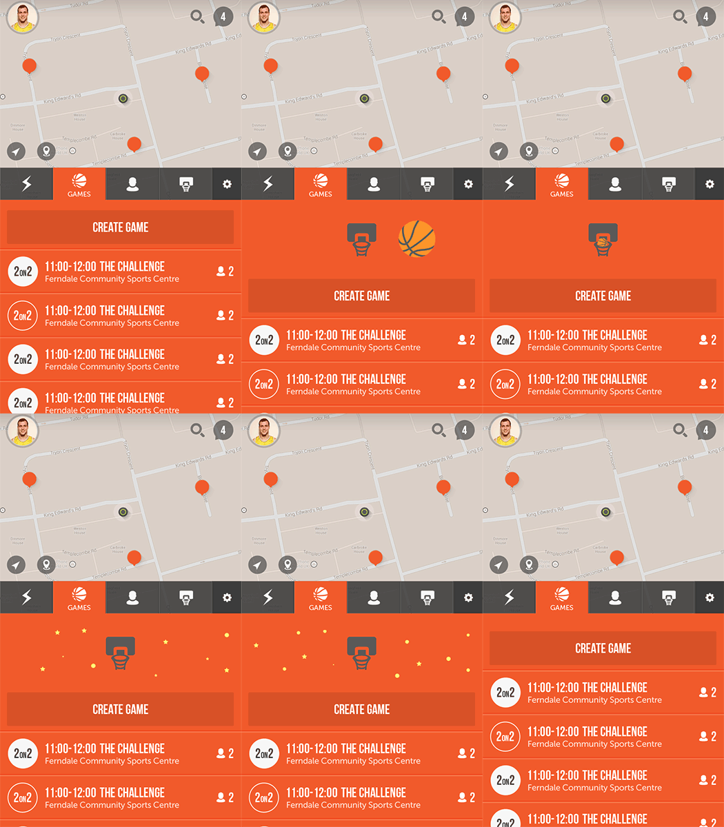
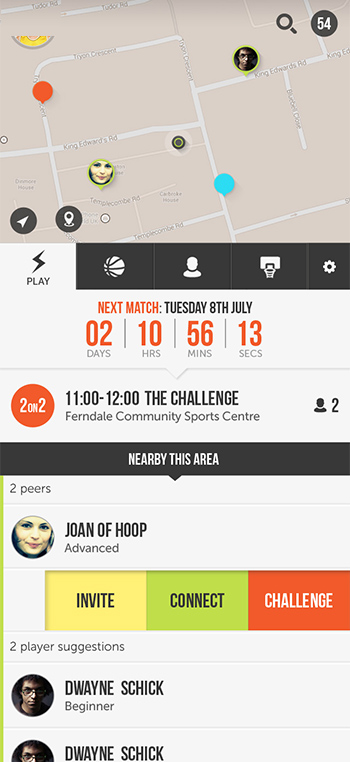
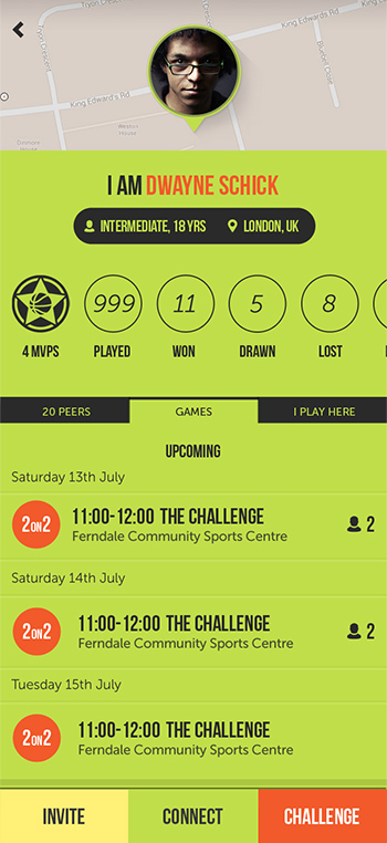
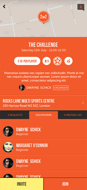
The platform is open to people of any level, age and physical condition, allowing them to use the different filters and tools.
Design played much with space to help accommodate multiple languages and future functionality. Colours were used to facilitate understanding the three pillars of the platform: games / action (orange), players (green) and courts / locations (blue).
Key responsibilities:
Analysing user testing results, user insights and feedback.
Collaborate closely with the team using an AGILE methodology to conceptualise, adapt, and iterate on UI features.
Designing user interfaces for desktop and iOS.
Supporting front-end and back-end developers on design and usability issues.
Balancing design intuition, business requirements and customer needs.
Documenting potential enhancements and solutions.
Create pitch desk presentations for potential investors.
I can definitely say that thanks to Teo, we’ve managed to bring to life several products in the last years. He’s proven to be a rock solid multi-skilled graphic hero. He has a natural instinct for UX and works really well under Agile ethos. He’s also a lot of fun! Something I also really appreciate from Teo is his commitment, willing and drive when he’s tasked. If you have a project with multiple legs, either to be started from scratch or half way through, you will not regret bringing Teo in.
